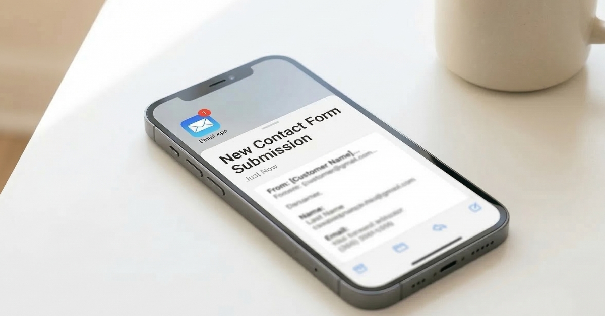
You’ve done everything right. Your website looks beautiful, your work is strong, and people are visiting. But the inquiries aren’t coming in the way you expected. The problem might not be your work, your pricing, or even your traffic. It might be your contact form. It’s the last step between an interested visitor and a real booking, and it’s the one thing most small business owners never think to check. Following contact form best practices is one of the simplest and most overlooked ways to turn a website that looks good into one that actually generates consistent inquiries.
This post is part of a series expanding on the Small Business Website Checklist: 9 Things Your Website Must Have. Point three on that list is a contact form that’s easy to find, and this post goes deep on exactly that. We’ll cover what makes a contact form work, what makes it fail, and the specific best practices that turn passive visitors into real inquiries.
What is a Contact Form and Why Does It Matter?
A contact form is the digital equivalent of a reception desk. It’s the place on your website where an interested visitor raises their hand and says yes, I want to talk to you. It collects their basic information, sends it to your inbox, and starts the conversation that eventually leads to a booking.
Every small business website needs one. Not just a phone number. Not just an email address sitting in your footer. A proper, functional, easy-to-find contact form that makes reaching out feel simple, welcoming, and worth doing.
The reason it matters so much is timing. When someone lands on your website and feels ready to inquire, that moment of readiness is brief. If finding your contact form takes more than a few seconds, or filling it out feels overwhelming, or it doesn’t work properly on their phone, that moment passes. They close the tab and move on to the next option. They don’t tell you. They just leave. And you never know how many potential clients you lost before they ever had a chance to become one.
Why Your Contact Form Might Be Losing You Clients
Most small business owners assume that if they have a contact form, it’s doing its job. But having a form and having a form that works are two very different things. Here are the three most common ways contact forms silently lose clients every single day.
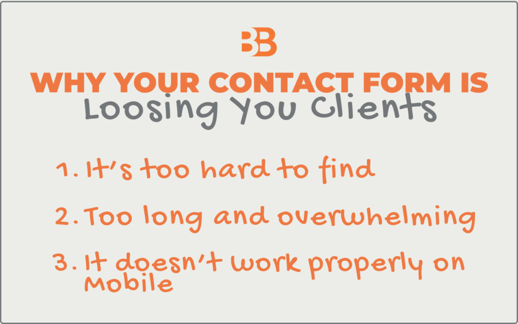
The first is that it’s too hard to find. If your contact page is buried in a dropdown menu, hidden at the bottom of your about page, or only accessible through your footer, most visitors will never find it. People don’t hunt for ways to contact you. They expect it to be obvious. If it isn’t, they move on.
The second is that it’s too long and overwhelming. A contact form with ten fields asking for every detail about your project before you’ve even had a conversation is one that most people won’t finish. Every extra field you add reduces your completion rate. A visitor who starts filling out a long form and abandons it halfway through is a lead you’ve permanently lost.
The third is that it doesn’t work properly on mobile. More than 65% of your website visitors are on a phone. If your contact form is difficult to fill out on a small screen with tiny fields and buttons that are hard to tap, most mobile visitors will give up before submitting. And because you never receive an incomplete submission, you’ll have no idea it’s happening.
Contact Form Examples: The Right, The Wrong, The Fix
Let’s look at how this plays out in practice using photographers as the example. Photography is one of the industries where contact form problems are most costly and most invisible because clients are making an emotional decision, and even the smallest amount of friction can send them elsewhere.
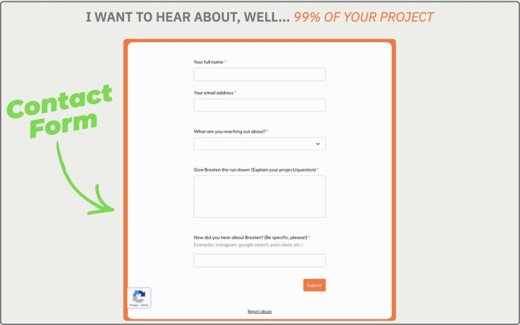
Contact Form Design Example # 1: The Right Number of Fields
The Wrong: A form with ten or more fields that asks for every project detail before a single conversation has taken place.
- It feels like a job application rather than an invitation to connect
- Most visitors won’t finish it, especially on mobile
- You lose leads at the very last step simply by asking for too much too soon
- The completion rate drops significantly with every additional field you add
The Right: Five fields is the sweet spot for a first contact form, giving you enough context without overwhelming the visitor.
- A name field so you can address them personally in your response
- An email address field, so you have a direct way to follow up
- A dropdown asking what they are reaching out about, so you understand their needs before you reply
- A message field where they can explain their project or situation in their own words
- A dropdown asking how they heard about you, so you can track where your best clients are coming from
Contact Form Design Example # 2: A Warm Confirmation Message
The Wrong: Leaving the default system text after submission or showing nothing at all once the form is sent.
- The visitor is left wondering whether their message actually went through
- It feels cold, impersonal, and unfinished
- Some visitors will submit the form multiple times out of uncertainty
- Others will assume the form is broken and reach out to a competitor instead
The Right: A personalised confirmation message that appears immediately after submission and makes the visitor feel confident and welcomed.
- Clearly confirms their submission went through, so there is no anxiety or uncertainty
- Tells them exactly when to expect a response from you
- Feels warm and personal rather than like a generic system notification
- Sets a professional and welcoming tone from the very first interaction
Contact Form Design Example # 3: Instant Email Notifications
The Wrong: Notifications set to a daily digest, going to an old email address, or routing silently into your spam folder.
- Inquiries sit unread for hours or days while the potential client moves on
- You have no awareness of how many leads you are missing
- A slow response signals to the client that you are unorganised or uninterested
- Lost leads at this stage are the most painful because the person was already ready to reach out
The Right: An immediate notification system that alerts you the moment someone submits your form.
- Sends an instant alert to an email address you check every single day
- Never set to a digest or summary format that delays your awareness of new inquiries
- Tested regularly to confirm it hasn’t started routing to your spam folder
- Gives you the best possible chance of responding while the person is still warm and engaged
Where Your Contact Form Should Live on Your Website
Placement is everything. A beautifully designed contact form that nobody can find is just as useless as no form at all. Here is exactly where your contact form needs to live to maximise the number of visitors who actually use it.
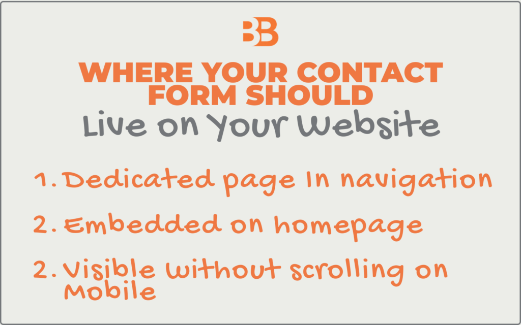
A dedicated Contact page in your main navigation. This is non-negotiable. Your Contact page should be one tap or one click away from anywhere on your site, visible in your primary navigation menu, and not hidden in a dropdown or buried in your footer. When someone decides they want to reach out, the path to your contact form should be immediate and obvious.
Embedded on your homepage. A shortened version of your contact form, or at a minimum, a clear button linking to your Contact page, should appear on your homepage. Many visitors never navigate beyond the homepage, especially on mobile. If your homepage doesn’t give them a clear path to reach you, a significant portion of your traffic never gets the opportunity.
Visible without scrolling on mobile. Pull out your phone right now and go to your Contact page. Is the form visible without scrolling? Is it easy to fill out with one hand? Are the fields large enough to tap accurately? If anything feels clunky or requires extra effort, your mobile visitors are experiencing that friction every single time they try to reach you.
How to Set Up Your Contact Form for More Bookings
Setting up a contact form that actually converts doesn’t require technical expertise. Here is a simple process you can work through.
Step 1: Choose the Right Tool
Most website platforms have a built-in contact form. Squarespace, Showit, and Webflow all have native form builders that are straightforward to set up and mobile-friendly by default. If your platform doesn’t, tools like Typeform or JotForm integrate easily with most websites and offer clean, professional form designs.
Step 2: Set Up Your Five Fields
Name, email address, a dropdown for what they are reaching out about, a message field, and a dropdown for how they heard about you. Resist the urge to add more at this stage. You’ll gather everything else once the conversation has started.
Step 3: Write a Warm Confirmation Message
Don’t leave the default “Your form has been submitted” text. Replace it with something personal and specific to you, including your name, your response time, and a genuine expression of excitement about connecting. This sets the tone for the entire client relationship from the very first interaction.
Step 4: Test the Form Yourself
- Fill it out completely on both desktop and mobile and submit it.
- Check that you receive the notification in your inbox immediately.
- Check that it didn’t go to your spam folder.
- Check that the confirmation message displays correctly.
- Do this every time you make changes to your website because forms break more often than most people realize.
Step 5: Check Your Notification Email Address
Make sure your form notifications are going to an email address you check daily. This sounds obvious, but it’s one of the most common reasons inquiries go unanswered. The notifications are going to an old email address or straight into a spam folder without anyone knowing.
Closing Thoughts on Contact Form Best Practices
Your contact form is the final step in a journey your potential client has been on since they first found you, whether that was through Google, Pinterest, a referral, or your Instagram. By the time they reach your contact form, they’re already interested. They’ve seen your work, they like what they see, and they’re ready to take the next step. Your job at that point is simply to not get in the way.
A contact form that’s easy to find, simple to fill out, and warm in its confirmation does exactly that. It removes every last obstacle between interest and inquiry and makes reaching out feel like the natural, obvious next step.
Here are three simple steps you can do today:
Step 1: Find your own contact form. Go to your website right now as if you’re a first-time visitor and try to find your contact form. Count how many taps or clicks it takes to get there. If it takes more than two, your form is too hard to find, and that needs to change today.
Step 2: Check your form fields. Open your contact form and review every single field you’re asking visitors to fill in. Make sure you have the five essential fields in place and remove anything beyond that which isn’t necessary for a first contact. You can always gather more information once the conversation has started.
Step 3: Submit your own form on mobile. Pull out your phone, fill out your contact form completely, and submit it. Check that it works smoothly, that the confirmation message appears, and that the notification arrives in your inbox immediately. If anything doesn’t work perfectly, fix it today.


